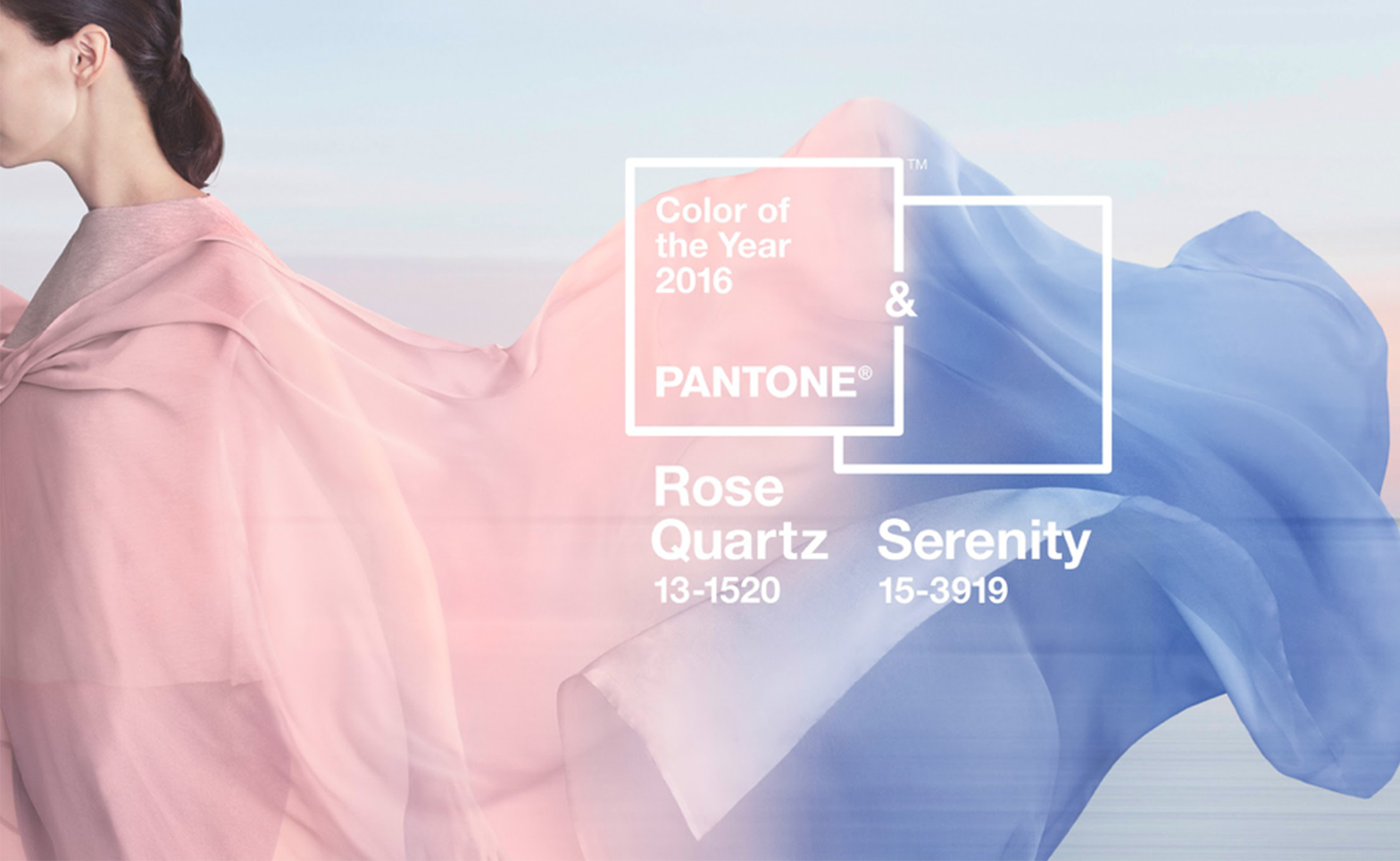
Pantone 2016 Color of the Year: Rose Quartz & Serenity
Photo Credit: Pantone
Every year, Pantone symbolically selects a color that’s a snapshot of an expression of a mood and attitude that is prominently taking place in our culture. For the first time, Pantone introduced a mix of two shades as the Color of the Year.
When Pantone announced its 2016 Color of the Year, we immediately fell in love! The color is a soft sunset blend of Rose Quartz, a gentle and embracing rose tone, and Serenity, a cooler ethereal blue. It symbolizes a balance of our yearning for a deeper sense of connection and reassurance along with soothing sense of peace and security. Take a look for yourself.
2015 was the year of fluidity and change. Pantone chose this blend to represent not only a gender blur in fashion and design, but also societal movements toward gender equality and fluidity. This color usage challenges traditional perceptions of color association. It reveals the consumer’s shift toward using color as a form of expression in a generation where individuality and an acceptance of differences transcend labels.
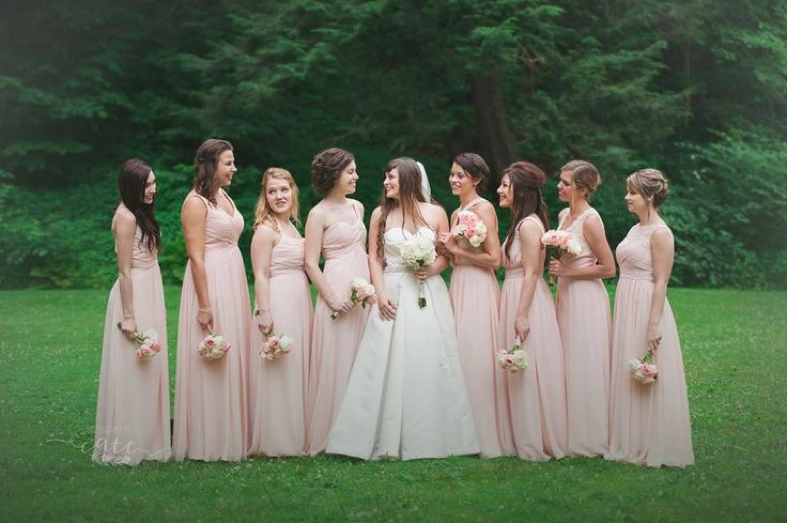
At Azazie, we matched these colors to our own palette and selected Dusty Rose or Blushing Pink and Lavender as a match for Rose Quartz and Serenity, respectively. If you’re interested in these colors, be sure to order some sample swatches since what you see on your computer screen can be different than the in person color!
Our Stylist, Paulette loved the Beverly, Kaleigh and Aliya in these shades. For those looking for shorter options, we picked the Cierra, Betty and Camellia. For junior bridesmaids, we adore the Tiana and Lilo.
Check out at these Azazie lovelies in similar tones!

2 Comments
jc
perfect
onward
I love it